
Dynamism
In general terms it refers to energy and vigor in work. In reference to Physics, it means change. It is derived from the root word dynamics which again means the phenomenon of change.
So, I hope you enjoyed my last article on differentiating between a house and home. Recently I was trying to build some concepts for a logo designing contest at freelancer and I found myself in a difficult situation trying to depict some abstract words on paper.
Design Brief
I think, I should start with the brief, first, so that you can understand what I mean here.
The logo itself must be standalone with no text.
The logo should be simple, elegant with clear design
The logo should communicate trust and maybe action,
It needs to be professional and eye catching.
And it was in the business of what it referred to as the teambuilding company. The name was ONSIGHT. They expected to include a few other things as well; first being a representation of a global company that reaches to anywhere to its customers, second being dynamic strategy to support individual customers accordingly.
Although I did not win it, albeit was rated 3 Stars, but still I’d like to share my experience with the brand research and conceiving the design. It can surely guide you in your work and if you get every bit right, might crack a deal or two.

Let’s Start
So, the first thing is to pick the words of relevance to our project. This is the most important step, as your decision on choosing one and leaving out another might be the turning point in your life. Now, I am saying this because whenever we designers try to encompass different abstract words and depict them on a paper, it is not always possible to show every aspect of the client brief, and therefore, we emphasize on some things and leave out the others.
I picked up the following words: team, trust, action, dynamism, global and their name onsight.
Trust
One of the most relevant word in any business. Whenever we hear this words we also recall a phrase circle of trust. Always start with a googling the words and see what others see when they google those words. 
So, we can think of showing holding hands, a circle of holding hands or a minimal circle. What I chose was just a circle because my niche is minimalistic artwork. Hence, I started with something shown below.

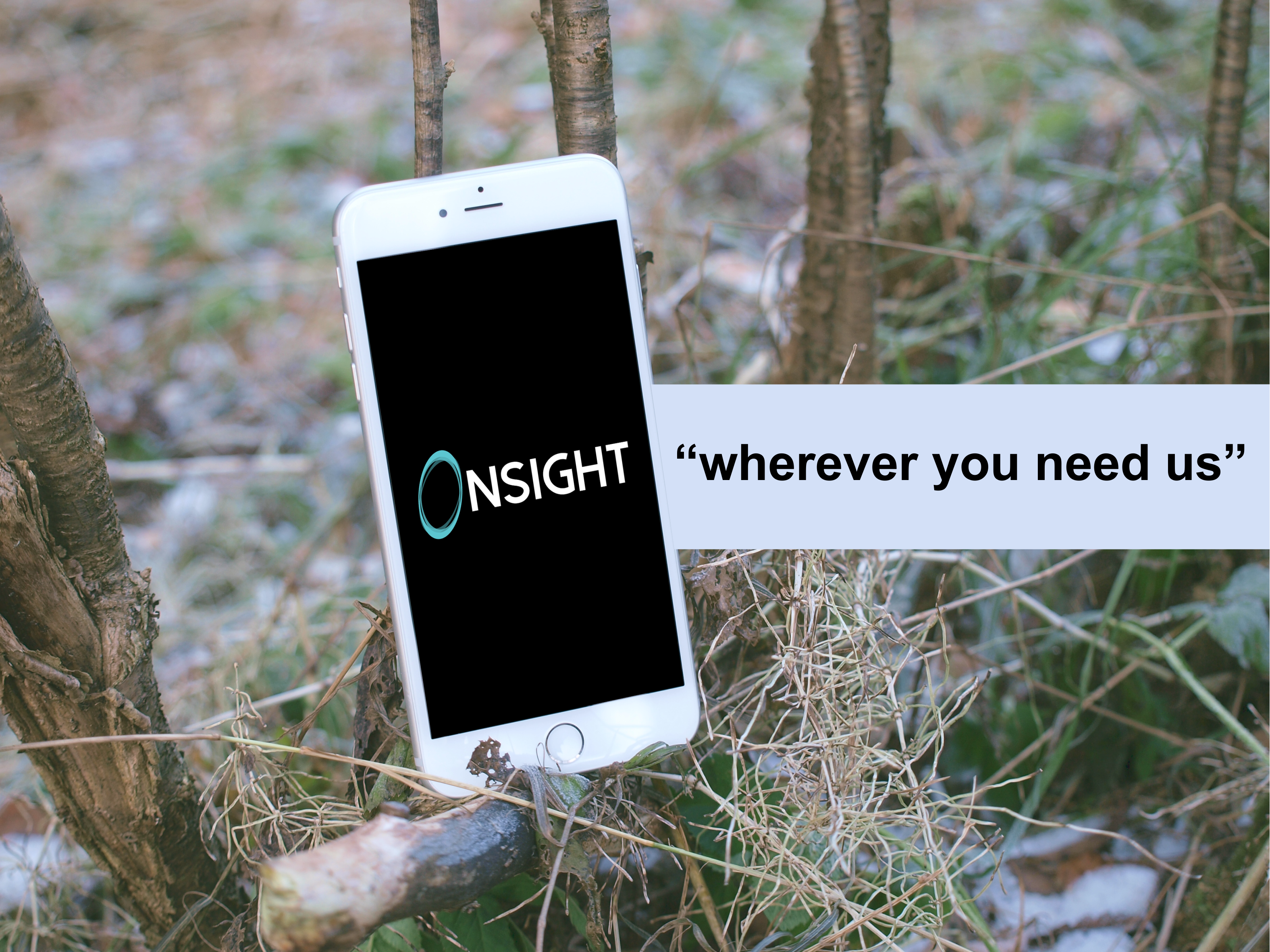
OnSight
I took note of the name of the company, next, because most of the time the graphic icon must relate to the name, and if you noticed earlier, they meant to have a standalone design. Therefore it must relate to their name as well.
The words onsight can be broken as on + sight = on sight. Thus, we have to bring in vision, sight or perhaps an eye that is representative of the term sight.

Sight

Global
The next thing that I thought about is the term global. It means somethings that spans around the globe, around the earth, is international and has outreach to ideally anywhere on earth. Therefore the next thing was to relate this concept to our design. Let me show how I did that, below.
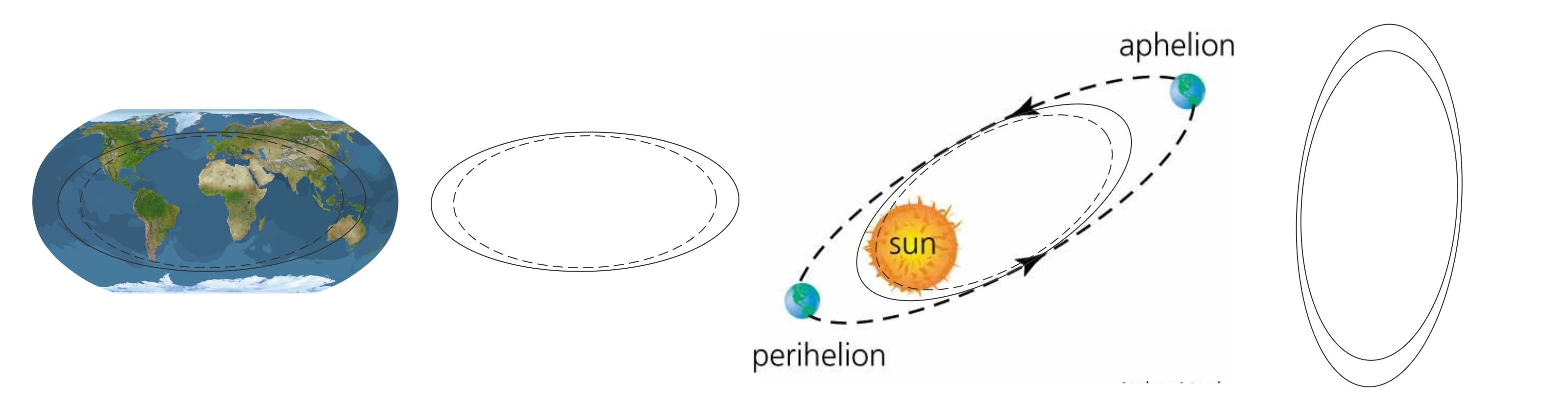
Earth

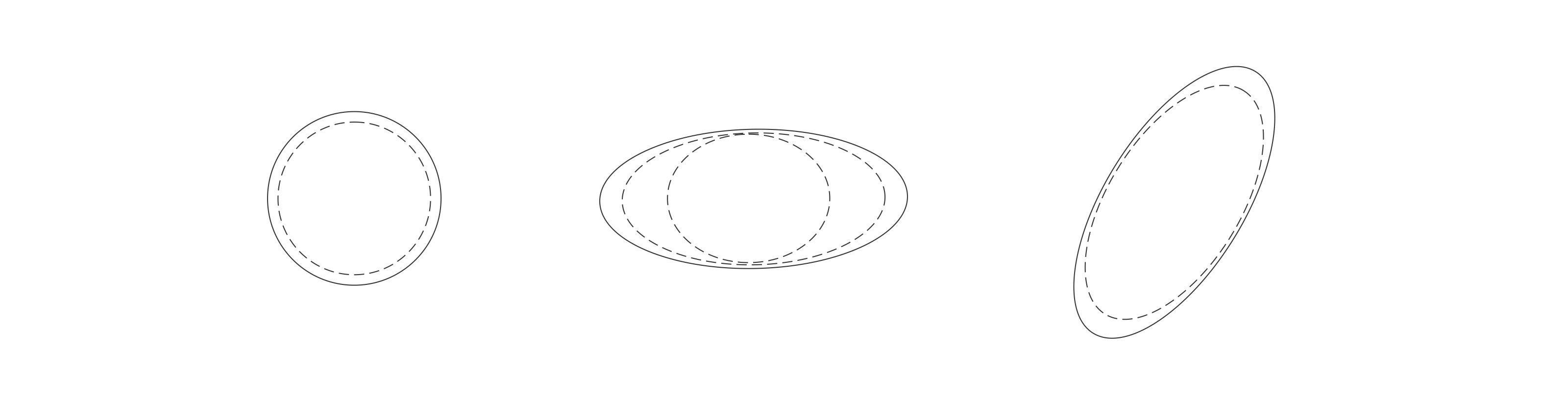
Team
The occupation that the company is into, must be taken care too. It mentioned about team building and therefore comes the concept of a team.
The ellipse is duplicated a number of times to represent more than one and hence, a team.

Team

and thus we arrive at our final design shown below.
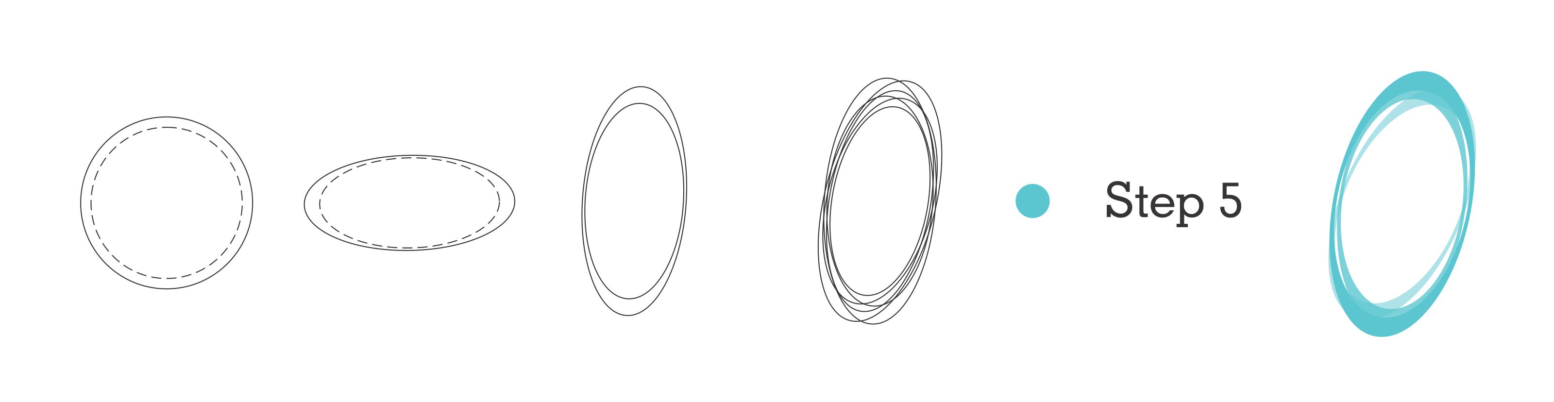
Finally, Dynamism
So, finally I’ll show you how did we take care of dynamism in this whole concept. This was the most daunting task considering that there are thousands of logos that represent speed and dynamism and the most generic ones being arrows and horizontal parallel lines. So, I had to think something else that was unique and complementary to the designs I’d conceived so far.
The word dynamism is derived from dynamics, referring to energy or vigor in action, movement, change or morphism.
Dynamics
Representation
Even though you have the best product in your hand, unless you know how to express it the best way to capture the audience, it is a total waste of time. Expression is the key to success. Therefore always acknowledge your designs with mockup that supplement your design.


So, did you like the story of…


Recent Comments